
Analysing a single nominal variable
visualisation (bar-chart)
Note: if you prefer to watch a video on bar-charts click here
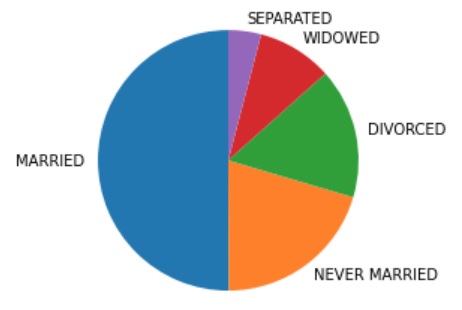
In the previous part we got a decent impression of the data for this variable, let’s make a visualization out of it. For a nominal variable we have a few possible charts that could be made: pie-chart, bar-chart, (Cleveland) dotplot, and Pareto chart. An example of each is shown below.
Figure 1
Example of pie-chart, bar chart, dot plot, Cleveland dot plot, and Pareto Chart
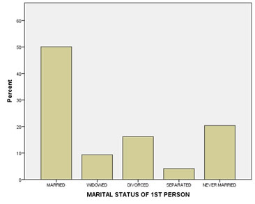
A bar chart is almost always preferred. In the appendix at the bottom of this page you'll find more information on the other charts, but I'll use a bar-chart. A bar-chart is defined as “a graph in which bars of varying height with spaces between them are used to display data for variables defined by qualities or categories” (Zedeck, 2014, p. 20). An example is shown in Figure 2.
Figure 2
Results of marital status
Click here to see how to create a bar-chart
with Excel
Excel file from video VI - Bar Chart (Simple).xlsm.
with Python
Jupyter Notebook from video: VI - Bar Chart (Simple).ipynb.
Data file used: GSS2012a.csv.
with R (Studio)
R script from video VI - Bar Chart (Simple).R.
Data file used: GSS2012-Adjusted.sav.
with SPSS
There are a few different ways to obtain a (simple) bar-chart with SPSS. The end result for each will be the same.
using Chart builder
Watch the video below, or follow the instructions in this pdf (via bitly, opens in new window/tab).
Data file used: StudentStatistics.sav.
using Legacy dialogs
Watch the video below, or follow the instructions in this pdf (via bitly, opens in new window/tab).
Data file used: StudentStatistics.sav.
using Frequencies
Watch the video below, or follow the instructions in this pdf (via bitly, opens in new window/tab).
Data file used: StudentStatistics.sav.
using an existing table
Watch the video below, or follow the instructions in this pdf (via bitly, opens in new window/tab)
Data file used: StudentStatistics.sav.
When showing a bar-chart it is good to also talk a little bit about it. Usually the peak is mentioned (known as the mode, this term will be discussed later in this section) and perhaps a few of the very low ones. It always depends on the situation, but inform your reader what you notice from the graph or what you want to show.
Note that in a bar-chart each bar has the same width, and also the gaps between the bars is equal. These gaps between bars, are to highlight the nominal nature of the variable.
If you see a bar-chart always check where the vertical axis begins and ends. If it does not start at zero it could be misleading, and if the scale goes far higher than necessary.
Also check what the vertical axis represent. The results will look quite different if you use absolute frequencies or cumulative frequencies.
In the report I recommend using a ‘Introduce – Show – Tell’ approach. So when reporting this graph, it could be for example like this:
The media often reports that people are getting less often married these days. To investigate this claim Figure 1 shows the results of the marital status in the survey.
Figure 1
Results of marital status
As can be seen Figure 1 almost 50% of the respondents is married and only a few were separated.
Depending on which frequency is used in the bar-chart, the visualization might look quite different. A bar-chart showing cumulative frequencies will for example always go up. To avoid misleading charts some statistical measures, try to describe the data. This will be the topic for the next section.
Appendix
Some more notes on bar-charts (click to expand)
As a guideline for the size of the bar there is a rule of thumb known as the 'three quarter high rule' (Pitts, 1971). It means that the height of the vertical axis should be 3/4 of the length of the horizontal axis. So if the horizontal axis is 20 cm long, the vertical axis should be 3/4 * 20 = 15 cm high.
According to Singh (2009) vertical bars (instead of horizontal bars) are preferred since they are easier on the eye. However if you have long category names some names might become unreadable. A bar chart with the bars placed horizontally might then be preferred. One of the earliest found bar-charts from William Playfair (1786) has the bars placed horizontally. There is an earlier bar chart by Oresme (1486), but that is used more for a theoretical concept, than for descriptive statistics.
Pie chart (click to expand)
Note: if you prefer to watch a video on pie-charts click here
Most definitions of a pie-chart describe the shape. For example one definition is given as “a graphic display in which a circle is cut into wedges with the area of each wedge being proportional to the percentage of cases in the category represented by that wedge” (Zedeck, 2014, p. 260). An example is shown in Figure 3.
Figure 3
Results of marital status
The pie-chart is quite popular and often used, but actually has a few disadvantages. It can only show relative frequencies. To show other frequencies the numbers themselves have to be added. A circle has 360 degrees, equal to 100%. So by multiplying the relative frequencies with 360, the degrees for each category can be found. This means that visually the pie-chart can only show the relative frequencies.
Another disadvantage is when the relative frequencies are close to each other, the differences are not easily seen in a circle diagram.
As a third disadvantage, when there are many categories the circle diagram will look very busy and not easily to read.
People also have more difficulty with comparing areas and angles (what you do when looking at a pie-chart) than comparing heights (what is done with a bar-chart).
Also often a 3D effect is added, but this actually makes comparisons of the slices even more difficult.
The name 'pie chart' might come from a misspelling of the word Pi. Pi is often associated with a circle. It might also simply come from the resemblances with a pie (as in apple-pie). However Srivastava and Rego (2011) put forward another belief that it is named after a royal French cook Pie, who served dishes in a pie-chart shape.
Click here to see how to create a pie chart
with Excel
Excel file used: VI - Pie chart.xlsm
with Python
Jupyter notebook used: VI - Pie Chart.ipynb
Data file used: GSS2012a.csv
with R
Jupyter Notebook from video: VI - Pie chart.ipynb
R code from video: VI - Pie chart.R
Data file used: GSS2012-Adjusted.sav
with SPSS
There are a four different ways to create a pie-chart with SPSS. The end result for each will be the same.
using Chart builder
watch the video below, or download the pdf instructions (via bitly, opens in new window/tab).
Data file used: StudentStatistics.sav
using legacy dialogs
watch the video below, or download the pdf instructions (via bitly, opens in new window/tab).
Data file used: StudentStatistics.sav
using an existing table
watch the video below, or download the pdf instructions (via bitly, opens in new window/tab).
Data file used: StudentStatistics.sav
using Frequencies
watch the video below, or download the pdf instructions (via bitly, opens in new window/tab).
Data file used: StudentStatistics.sav
Manually
Dot plot (click to expand)
Note: if you prefer to watch a video on dot plots and Cleveland dot plots click here
According to the Oxford Dictionary of Statistics a dot plot can be defined as "an alternative to a bar chart or line graph when there are very few data values. Each value is recorded as a dot, so that the frequencies for each value can easily be counted" (Upton & Cook, 2014, p. 129). Note that in this definition a *bar chart* is mentioned. A bar chart can be defined as “a graph in which bars of varying height with spaces between them are used to display data for variables defined by qualities or categories” (Zedeck, 2014, p. 20). Together this indicates that a dot plot is used for categorical data.
However, Zedeck sees the dot plot as an alternative name for a scatterplot, which is for continuous data. A third version comes from the Cambridge Dictionary of Statistics: "A more effective display than a number of other methods, for example, pie charts and bar charts, for displaying quantitative data which are labelled" (Everitt, 2004, p. 123). They also show an example where we see a categorical variable on one axis, and a continuous variable on another.
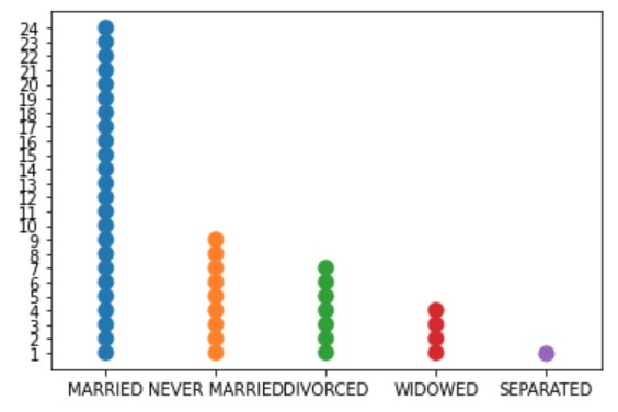
Here the first interpretation is used i.e. a diagram for categorical data. If the frequencies of a category is very high there might not be enough space to show all the dots. It is therefore adviced to only use this type of diagram if you have a limited number of categories. Another solution might be to let one dot then not represent a single observation but for example 1 dot = 10 respondents, or any other conversion. An example is shown in Figure 4 where each dot represents 40 cases.
Figure 4
Dotplot of marital status
Click here to see how to create a dot plot
with Excel
Excel file used in video: VI - Dot plot.xlsm
with Python
Jupyter Notebook used in video: VI - Dotplot.ipynb
Data file used: GSS2012a.csv
with R
R file from video: VI - Dotplot.ipynb
Data files used: GSS2012-Adjusted.sav and StudentStatistics.sav
with SPSS
There are a two different ways to obtain a dot plot with SPSS. The end result for each will be the same.
using Chart builder
watch the video below, or download the pdf instructions (via bitly, opens in new window/tab).
Data file used: StudentStatistics.sav
using legacy dialogs
watch the video below, or download the pdf instructions (via bitly, opens in new window/tab).
Data file used: StudentStatistics.sav
Cleveland dotplot (click to expand)
Note: if you prefer to watch a video on dot plots and Cleveland dot plots click here
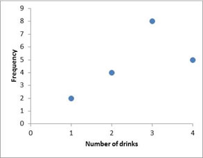
A Cleveland dot plot (Cleveland & McGill, 1987) is a bar chart where instead of bars a dot is placed at the center of the top of the bar (and then the bars removed). It is a dot plot only showing the top dot.This requires less ink. An example is shown in Figure 5.
Figure 5
Example of a Cleveland Dot Plot
Click here to see how to create a Cleveland dot plot
with Excel
Excel file used in video: VI - Cleveland Dot plot.xlsm
with Python
Jupyter Notebook used in video: VI - Cleveland Dotplot.ipynb
Data file used: GSS2012a.csv
with R
R file from video: VI - Cleveland Dot plot.R
Data files used: GSS2012-Adjusted.sav
with SPSS
There are a two different ways to obtain a Cleveland dot plot with SPSS. The end result for each will be the same.
using Chart builder
watch the video below, or download the pdf instructions (via bitly, opens in new window/tab).
Data file used: StudentStatistics.sav
from an existing table
watch the video below, or download the pdf instructions (via bitly, opens in new window/tab).
Data file used: StudentStatistics.sav
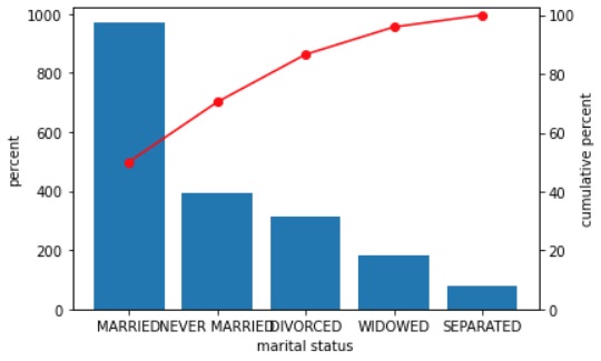
Pareto Chart (click to expand)
Note: if you prefer to watch a video on Pareto Charts click here
The Pareto Chart gets its name from the Pareto Principle, which is named after Vilfredo Pareto. This principle states that roughly 80% of consequencies come from 20% of causes.
Unfortunately, there is no general agreed upon definition of a Pareto diagram. The most general description I’ve found was by Kemp and Kemp (2004) who mention it is a name for a bar chart if the order of the bars have no meaning (i.e. for a nominal variable), and they only mention that often the bars are then placed in decreasing order. According to some authors a Pareto diagram is any diagram with the bars in order of size (Joiner, 1995; WhatIs.com, n.d.), while others suggest that a line representing the cumulative relative frequencies should also be included (Weisstein, 2002). Upton and Cook (2014) also add that the bars should not have any gaps, but many other authors ignore this.
I will use the following definition: a bar chart where the bars are placed in descending order of frequency. Usually an ogive is added in the chart as well.
An ogive (oh-jive) is: "the graphs of cumulative frequencies" (Kenney, 1939). An example of a Pareto chart is shown in Figure 6.
Figure 6
Example of a Pareto Chart
Click here to see how to create a Pareto Chart
with Excel
Two different ways to go about this. A direct approach, or indirect but giving more control.
Direct
Indirect
The Excel file used in both videos: VI - Pareto Plot.xlsm
with Python
Jupyter Notebook used in video: VI - Pareto Chart.ipynb
Data file used: GSS2012a.csv
with R
with base only
Jupyter notebook: VI - Pareto Chart.ipynb
R code: VI - Pareto Chart.R
Data file used: GSS2012a.csv
with ggplot2
Jupyter notebook: VI - Pareto Chart (ggplot2).ipynb
R code: VI - Pareto Chart.R
Data file used: GSS2012a.csv
with SPSS
Data file used: Holiday Fair.sav
Reading dual-axis charts and also cumulative results requires the reader to be familiar with this. It is a bit more technical and that is why I would recommend using this only if you can assume the readers are familiar with this, and the Pareto Principle is indeed important for the analysis you are performing.
Single nominal variable
![]()

Google adds