
Analysing a nominal and ordinal variable
Part 1: Impression of the sample data (cross table)
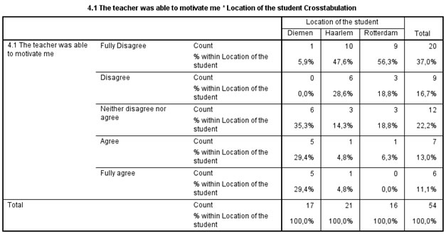
To begin with analysing if there are any differences between the categories in the nominal variable, and how the responses are in the ordinal variable, we might want to start with seeing the absolute results in a so-called cross table (also known as contingency table). In the example I'm curious if there are any differences between the three locations (Diemen, Haarlem and Rotterdam) and the opinion of the students on if the teacher was able to motivate them. In Table 1 the cross table is shown.
Click here to see how you can create a cross table as above with SPSS, with R, or with Excel
with SPSS
There are a two different ways to create a cross table with SPSS.
using Crosstabs
using Custom Tables
with R
with Excel
Note that the percentages are per location (nominal variable), so we can easily compare them between the locations. We can see that for both Haarlem and Rotterdam a lot of students disagreed with the statement, while in Diemen the students seemed happier with the teacher.
I would not report the table itself (perhaps in an appendix) but rather visualise the results. By having looked at the table first we can also check if the visualisation is correct. Which chart and how to create and report it, will be discussed on the next page.
Nominal vs. Ordinal
![]()

Google adds