
Analysing two scale variables
Part 2: Visualisation
From the descriptive measures on the previous page we got a quick impression for each of the two scale variables, but to see if they might have a relationship between them a visualisation might be more insightful. To visualise two scale variables usually a scatter plot is used as shown in Figure 1.
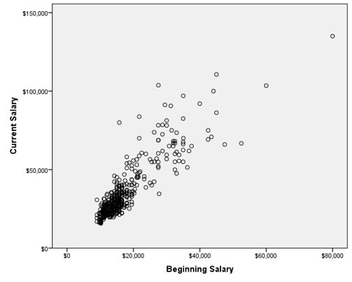
Figure 1. Beginning salary vs Current salary.
Click here to see how to create a scatterplot as shown with SPSS, R (Studio), Excel, or Python
with SPSS
Three methods to generate a scatterplot with SPSS, click the one you prefer
using the Chart Builder
using Legacy dialogs
using Curve estimation
with R (Studio)
with Excel
with Python
From the chart we see that there seems to be a somewhat upwards pattern, indicating that the higher the beginning salary, the higher the current salary. In the report I recommend using a ‘Introduce – Show – Tell’ approach. So when reporting this graph, it could be for example like this:
HRM is interested to know if the beginning salary can be used to predict the current salary. From a sample of employees the scatterplot in Figure 1 was produced.
As can be seen Figure 1 it appears that there is an upwards correlation between the beginning and the current salary. |
Now that we have a good impression of the sample data, let's move on to see what could be said about the population based on this on the next page.

Google adds