Nominal vs Nominal
Part 2: Visualisation
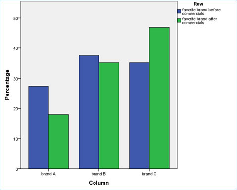
To visualise two nominal variables we can make use of a clustered bar-chart. Again if you are only interested if the overall proportions changed, you can compare the before and after percentages as in Figure 1.
Click the button below to see how to create a clustered bar chart...
with SPSS
From Figure 1 we can see that for Brand A the percentage has dropped a lot, while for brand C it increased a lot, and for brand B it dropped a little.
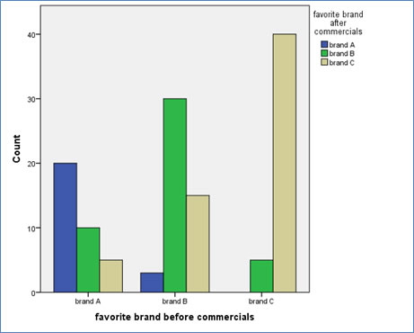
If we are curious how these changes occured more specifically we can also create a bar-chart as shown in Figure 2.
Click here to see how you can create a clustered bar-chart as above, with SPSS, R (Studio), Excel, or Python.
with SPSS
There are a two different ways to create a clustered bar chart with SPSS.
using the chart builder
using legacy dialogs
with R (Studio)
with Excel
with Python
From Figure 2 we can see that the majority remained with their original choice, quite some people switched from brand B to brand C, but also a few from brand A to B.
To test if these changes are actually significant we can use a few different tests, which will be explained on the next page.

Google adds