
Ordinal vs Ordinal paired
Part 2: Visualisation
On the previous page we noticed that before the commercial the scores were fairly evenly distributed among the categories, but after the commercial the first category seems to have a relatively high amount of cases. To visualise the result I would use a compound bar-chart as shown in Figure 1, which takes advantage of the ordinal nature of the ordinal variable.
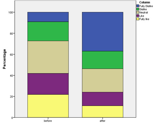
Figure 1. Before and after seeing commercial sample results.
Click here to see how to create a stacked bar-chart as shown above with SPSS, R (Studio), Excel, or Python.
with SPSS
with R (Studio)
with Excel
with Python
We can see clearer now that it seems indeed that after seeing the commercial respondents were less happy with the brand.
The next step will be to perform a test to see if there might also be a difference in the population. This will be the topic for the next page.

Google adds