
Scale vs Scale paired
1b: Visualisation
To visualise two paired scale variables we can use the same type of diagrams as for the unpaired variables; a scatterplot. I would however also add a reference line to help see the differences. In Figure 1 the scatterplot of the example from the previous page.

Figure 1. Scatterplot before vs after with reference line.
Click here see how to create a scatterplot as shown above with SPSS, R (Studio), Excel, or Python.
with SPSS
the scatterplot
Three methods to generate a scatterplot with SPSS, click the one you prefer
using the Chart Builder
using Legacy dialogs
using Curve estimation
the reference line
with R (Studio)
with Excel
with Python
The reference line in Figure 1 is the y = x line. For any point above this line it means the after score was higher than the before score, and for any point below it the before score was higher. We can see that there appear to be more scores above the line than below.
We could also add a histogram of the differences (difference = after - before) to focus more on these differences, as shown in Figure 2.
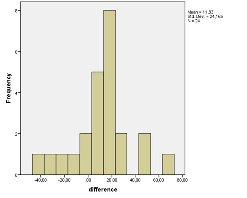
Figure 2. Histogram of differences.
Click here to see how to create the difference variable and the histogram with SPSS, with R, or with Excel
with SPSS
create difference variable first (with compute)
create the histogram
There are a four different ways to create a histogram with SPSS.
using Chart Builder
using Legacy Dialogs
using Frequencies
using Explore
with R
You can add the difference variable to your data by using for example myData$Diff <-myData$after-myData$before, then create the histogram of the difference variable as shown in the video below
with Excel
You can add the difference variable to your data simply creating a new column that calculates the difference (be careful though with missing values), then create the histogram of the difference variable as shown in the video below
equal class widths
unequal class widths
From Figure 2 we see the same result: more positive differences than negative. In the sample there seem to be a positive overall effect of the commercial since the positive differences outweigh the negative.
A third possible visualisation is a split-histogram as shown in Figure 3, which is an alternative to the scatterplot in Figure 1.
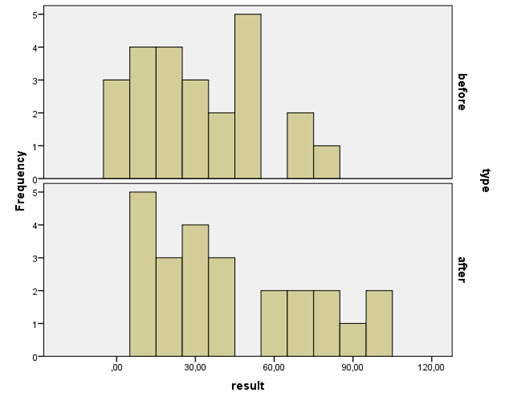
Figure 3. Split histogram of before and after.
Click here to see how you can create a split histogram of two scale variables with SPSS, with R, or with Excel.
with SPSS
with R
with Excel
You can use a similar technique as for the split histogram shown for nominal vs. scale.Unfortunately it is not possible (to my knowledge) to create a singele chart that shows a split histogram, however you could mimic the result by showing three different histograms and place them underneath each other.
Also from Figure 3 the conclusion remains the same, that it appears that the after results are more positive.
To check if this difference (in means) might also occur in the entire population (and not only in the sample) we need a statistically test, which will be the topic for the next page.

Google adds