
Analysing a single scale variable
1b: Visualisation
In the previous part we got a first impression of the data, but it might be good to also visualise the results. Two commonly diagrams that could be used is the histogram and a box plot. I will explain use the histogram here, but for the interested reader the box plot is discussed in appendix at the bottom of this page.
To illustrate a histogram we start with showing what we would get if we simply drew a bar-chart of the scale variable as shown in Figure 1.
Figure 1.
Bar chart of a scale variable

In the bar-chart for each chosen age a bar is drawn with the height of the counts. In section 2.2 the bar-chart was discussed in more detail, but there are so many bars that for a scale variable this often is not very insightful. To reduce the number of bars, the scale variable is often recoded into categories (bins), as we also did in the previous section. If the bins are then of equal width (size) we get the bar-chart shown in Figure 2.
Figure 2.
Bar chart of a binned scale variable

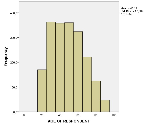
To emphasize that we actually have the original scores, and did not ask on the survey for the age category (but really simply their age), the bars are placed next to each other and the horizontal scale becomes a number line. This chart is then no longer called a bar-chart, but a histogram. Figure 3 show the histogram of the age of the respondents.
Figure 3.
Histogram of scale variable.
Click here to see how to create a simple histogram...
with Excel
Two videos, one on how to create a simple histogram when bin sizes are equal, and one for unequal
equal class widths Excel 2007-2013
Excel file from video: VI - Histogram (single).xlsx.
equal class widths Excel 2016-2019
Excel file from video: VI - Histogram (single).xlsx.
unequal class widths
Excel file from video: VI - Histogram (single).xlsx.
with Python
Jupyter Notebook used in video: VI - Histogram.ipynb.
Data file used in video and notebook GSS2012a.csv.
with R (Studio)
R script used in video: VI - Histogram.R.
Datafile used in video: GSS2012-Adjusted.sav
with SPSS
There are a four different ways to create a histogram with SPSS.
using Chart Builder
watch the video below, or download the pdf instructions (via bitly, opens in new window/tab).
Datafile used in video: Results.sav
using Legacy Dialogs
watch the video below, or download the pdf instructions (via bitly, opens in new window/tab).
Datafile used in video: Results.sav
using Frequencies
watch the video below, or download the pdf instructions (via bitly, opens in new window/tab).
Datafile used in video: Results.sav
using Explore
watch the video below, or download the pdf instructions (via bitly, opens in new window/tab).
Datafile used in video: Results.sav
Originally a histogram should also make use of something known as frequency densities (Pearson, 1895, p. 399), but if you keep the width of each bin the same, this can be ignored.
When showing a chart it is good to also talk a little bit about it. For a scale variable you might want to describe the shape of the histogram. It of course always depends on your specific data, but inform your reader what you notice from the graph or what you want to show.
An alternative for a histogram that is sometimes used is a box-plot. This diagram however requires knowledge of quartiles, and outliers. Although a box-plot might in some cases be a better diagram to use then a histogram, you should also wonder if your reader(s) will understand a box-plot. A histogram is often easily understood, by people but a box-plot isn’t. In the appendix below you can read more on box plots
Besides a frequency table and it's visualisation, we can also use some measurements to describe the data. This is the topic for the next section.
Appendix: Box-and-Whiskers Plot
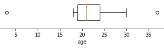
A box plot is a little more complex visualisation than a histogram. An example is shown in figure 4.
Figure 4.
Example of a Box Plot
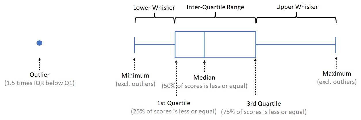
It shows the five quartiles (e.g. minimum, 1st quartile, median, 3rd quartile, and maximum). It can also be adjusted to show so-called outliers.
The first quartile is the point for which 25% of all scores is less or equal, the median is 50% and the third quartile 75%. Note that for the calculation of the quartiles various methods exist (see https://mathworld.wolfram.com/Quartile.html).
To create the box plot, a 'box' is drawn with the 1st and 3rd quartile at either end. A line in the box is drawn at the median. Then from the middle of each end a line (whisker) is drawn to the maximum and minimum. This was actually a 'range chart' (Spear, 1952, p. 166) but somehow it is these days referred to as a box-and-whisker plot as named by Tukey (1977, p. 39)
Often values that are more than 1.5 times the inter-quartile range (iqr) above the 3rd quartile, or below the 1st are shown as a dot or asterisks, and the whiskers are then drawn till the first value that still falls within this 1.5 times iqr limit.
The inter-quartile range is simply the 3rd quartile minus the first.
In figure 5 each element is indicated.
Figure 5.
Annotated Box Plot
Note that in each of the main segments there is 25% of the data. So a longer segment would indicate that the data in that segment is more spread out. To visualise this a small animation is shown in figure 6.
Figure 6.
Box-Plot to Histogram Animation
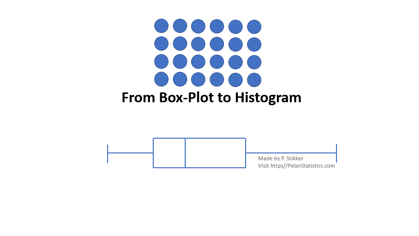
The animation starts with 24 data points represented as circles. Since for a box-plot each segment should have 25% of the data, we place 24/4 = 6 circles in each segment. Then draw a rectangle around each segment and you have a histogram from the box plot.
Click here to see how to create a box-and-whiskers plot...
with Excel
The easiest method with Excel is to draw a box-plot vertically, but if you must have it horizontally, it can be done
Vertical
Excel file from video: VI - Box Plot (single).xlsx.
Horizontal, using stacked bar trick
Excel file from video: VI - Box Plot (single).xlsx.
Horizontal, using scatterplot trick
Excel file from video: VI - Box Plot (single).xlsx.
with Python
video to be uploaded
Jupyter Notebook: VI - Box Plot (single).ipynb.
Data file used: GSS2012a.csv.
with R (Studio)
video to be uploaded
R script: VI - Box Plot (Single).R.
Data file used: GSS2012a.csv.
with SPSS
A box-plot of a single variable can either be made using the Chart Builder, or the Legacy Dialogs. It doesn't really matter which you use.
via Chart Builder
Data file: GSS2012-Adjusted.sav
via Legacy Dialogs
Data file: GSS2012-Adjusted.sav
Single scale variable
![]()

Google adds