(Cleveland) Dot Plot
Note: if you prefer to watch a video on dot plots and Cleveland dot plots click here
According to the Oxford Dictionary of Statistics a dot plot can be defined as "an alternative to a bar chart or line graph when there are very few data values. Each value is recorded as a dot, so that the frequencies for each value can easily be counted" (Upton & Cook, 2014, p. 129). Note that in this definition a bar chart is mentioned. A bar chart can be defined as “a graph in which bars of varying height with spaces between them are used to display data for variables defined by qualities or categories” (Zedeck, 2014, p. 20). Together this indicates that a dot plot is used for categorical data.
However, Zedeck sees the dot plot as an alternative name for a scatterplot, which is for continuous data. A third version comes from the Cambridge Dictionary of Statistics: "A more effective display than a number of other methods, for example, pie charts and bar charts, for displaying quantitative data which are labelled" (Everitt, 2004, p. 123). They also show an example where we see a categorical variable on one axis, and a continuous variable on another.
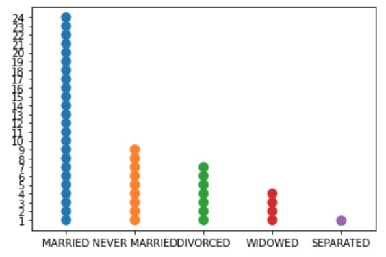
Here the first interpretation is used i.e. a diagram for categorical data. If the frequencies of a category is very high there might not be enough space to show all the dots. It is therefore adviced to only use this type of diagram if you have a limited number of categories. Another solution might be to let one dot then not represent a single observation but for example 1 dot = 10 respondents, or any other conversion. An example is shown in Figure 1 where each dot represents 40 cases.
Figure 1
Dotplot of marital status
Click here to see how to create a dot plot
with Excel
Excel file used in video: VI - Dot plot.xlsm
with Python
Jupyter Notebook used in video: VI - Dotplot.ipynb
Data file used: GSS2012a.csv
with R
R file from video: VI - Dotplot.ipynb
Data files used: GSS2012-Adjusted.sav and StudentStatistics.sav
with SPSS
There are a two different ways to obtain a dot plot with SPSS. The end result for each will be the same.
using Chart builder
watch the video below, or download the pdf instructions (via bitly, opens in new window/tab).
Data file used: StudentStatistics.sav
using legacy dialogs
watch the video below, or download the pdf instructions (via bitly, opens in new window/tab).
Data file used: StudentStatistics.sav
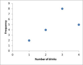
A Cleveland dot plot (Cleveland & McGill, 1987) is a bar chart where instead of bars a dot is placed at the center of the top of the bar (and then the bars removed). It is a dot plot only showing the top dot.This requires less ink. An example is shown in Figure 2.
Figure 2
Example of a Cleveland Dot Plot
Click here to see how to create a Cleveland dot plot
with Excel
Excel file used in video: VI - Cleveland Dot plot.xlsm
with Python
Jupyter Notebook used in video: VI - Cleveland Dotplot.ipynb
Data file used: GSS2012a.csv
with R
R file from video: VI - Cleveland Dot plot.R
Data files used: GSS2012-Adjusted.sav
with SPSS
There are a two different ways to obtain a Cleveland dot plot with SPSS. The end result for each will be the same.
using Chart builder
watch the video below, or download the pdf instructions (via bitly, opens in new window/tab).
Data file used: StudentStatistics.sav
from an existing table
watch the video below, or download the pdf instructions (via bitly, opens in new window/tab).
Data file used: StudentStatistics.sav

Google adds