
Box-and-Whisker Plot
Explanation
A box plot is a little more complex visualisation than a histogram. An example is shown in figure 1.
Figure 1.
Example of a Box Plot
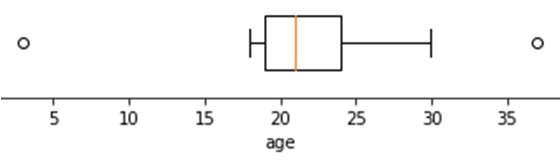
It shows the five quartiles (e.g. minimum, 1st quartile, median, 3rd quartile, and maximum). It can also be adjusted to show so-called outliers.
The first quartile is the point for which 25% of all scores is less or equal, the median is 50% and the third quartile 75%. Note that for the calculation of the quartiles various methods exist (see Quantiles page for more information).
To create the box plot, a 'box' is drawn with the 1st and 3rd quartile at either end. A line in the box is drawn at the median. Then from the middle of each end a line (whisker) is drawn to the maximum and minimum. This was actually a 'range chart' (Spear, 1952, p. 166) but somehow it is these days referred to as a box-and-whisker plot as named by Tukey (1977, p. 39)
Often values that are more than 1.5 times the inter-quartile range (iqr) above the 3rd quartile, or below the 1st are shown as a dot or asterisks, and the whiskers are then drawn till the first value that still falls within this 1.5 times iqr limit.
The inter-quartile range is simply the 3rd quartile minus the first.
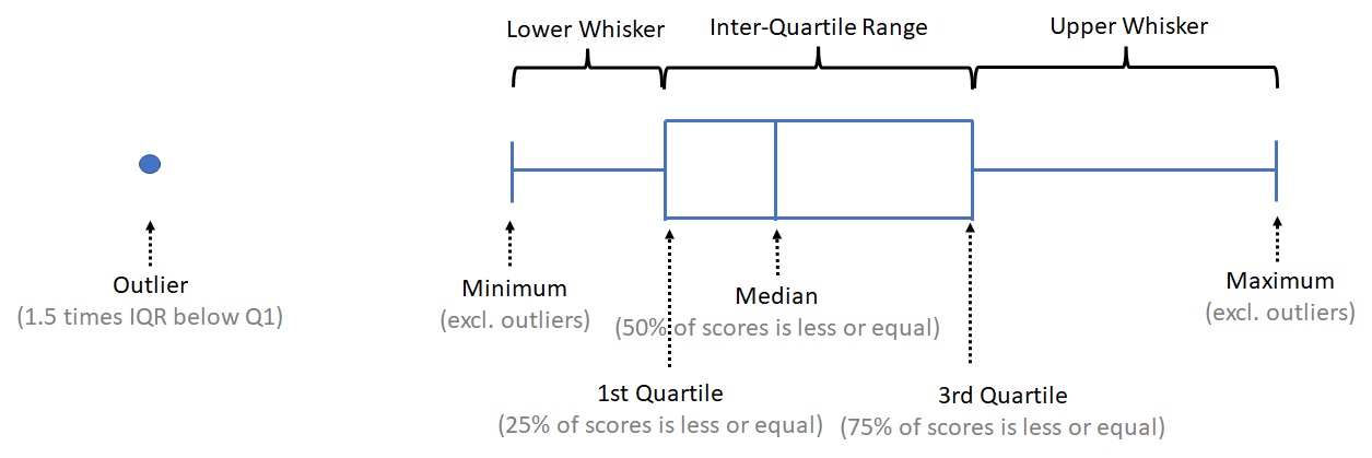
In figure 2 each element is indicated.
Figure 2.
Annotated Box Plot
Note that in each of the main segments there is 25% of the data. So a longer segment would indicate that the data in that segment is more spread out. To visualise this a small animation is shown in figure 3.
Figure 3.
Box-Plot to Histogram Animation
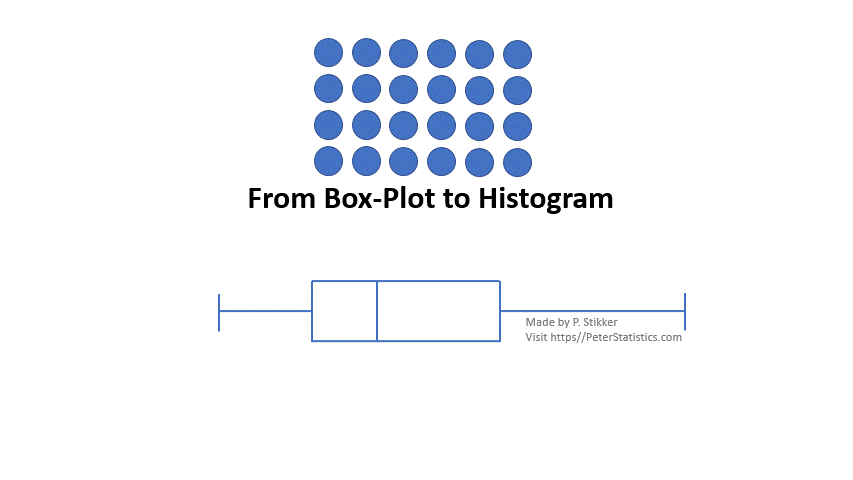
The animation starts with 24 data points represented as circles. Since for a box-plot each segment should have 25% of the data, we place 24/4 = 6 circles in each segment. Then draw a rectangle around each segment and you have a histogram from the box plot.
Creating the diagram
with Excel
Excel file from video: VI - Box Plot (single) (E).xlsx
The easiest method with Excel is to draw a box-plot vertically, but if you must have it horizontally, it can be done
Vertical
Horizontal, using stacked bar trick
Horizontal, using scatterplot trick
with R (Studio)
Notebook from video: VI - Box Plot (single) (R).ipynb
with stikpetR:
without stikpetR:
with SPSS
A box-plot of a single variable can either be made using the Chart Builder, or the Legacy Dialogs. It doesn't really matter which you use.
via Chart Builder
Data file: GSS2012-Adjusted.sav
via Legacy Dialogs
Data file: GSS2012-Adjusted.sav
Google adds