Histogram
Explanation
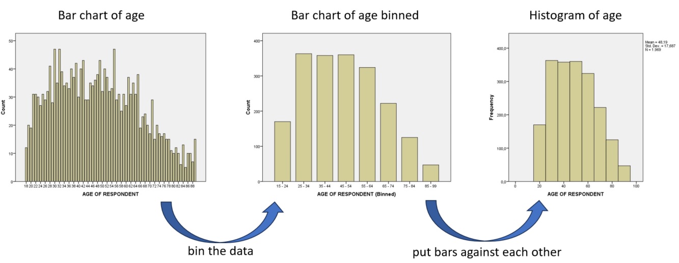
A histogram is often a bar-chart of numeric data that got binned and the bars next to each other. In figure 1 an example on how to go from a bar-chart of a scale variable to the histogram
Figure 1
From bar-chart to histogram
Originally though, a histogram should show the frequency density (Pearson, 1895, p. 399). This would be the frequency of the binned data, divided by the bin-width. If the bin sizes are all equal, this will not change the shape of the histogram, but if they are different, this will give a more fair visualisation. The area of the bar will then still show the frequency. In figure 2 a histogram using frequency densities.
Figure 2
Histogram using Frequency Density
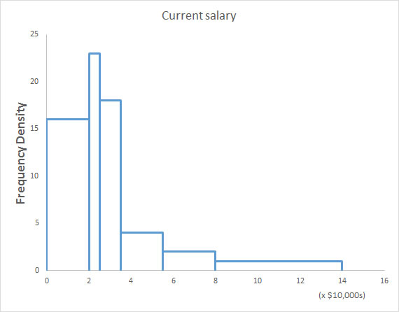
We can for example see from the histogram in figure 2, that the first bin that goes from 0 to 2 has most likely a frequency density of only 16. The number of people with a salary between 0 and 20,000 is therefor (2 x 16 =) 32. See the Density section at the frequency table page for more information about frequency density.
When showing a chart it is good to also talk a little bit about it. For a scale variable you might want to describe the shape of the histogram. It of course always depends on your specific data, but inform your reader what you notice from the graph or what you want to show.
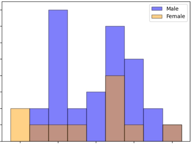
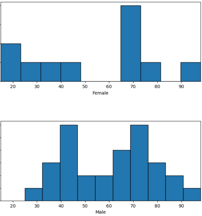
If you have data from two samples, you could create a histogram from each, and then either place them as any of the options in Table 1.
| overlaid | back-to-back | split |
|---|---|---|
 |
 |
 |
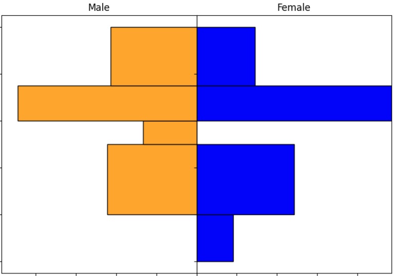
The back-to-back version is often done by using bars, and often referred to as a pyramid chart, although the shape not necesairily will look like a pyramid. I'll use the term 'butterfly chart' instead of this in case indeed bars are used, and otherwise back-to-back histogram (e.g. Lane and Sándor (2009)) (which is also referred to as a dual-sided histogram (e.g. Jelen (2005)).
The first two options only work with two samples, but the last option, also known as a split histogram, works with any number of samples.
Creating the diagram
click here for the simple version
with Excel
Excel file from video: VI - Histogram (single) (E).xlsx
with equal bin widths (2016 or later)
with equal bin widths (before v. 2016)
with unequal bin widths
with SPSS
Four different methods to get a histogram with SPSS, using Chart-builder, Legacy Dialogs, Frequencies, or Explore. A video for each is below.
using Chart-builder
using Legacy Dialogs
using Frequencies
using Explore
click here for the overlaid version
click here for the back-to-back version
with SPSS
Alternatives
An alternative for a histogram that is sometimes used is a box-plot. This diagram however requires knowledge of quartiles, and outliers. Although a box-plot might in some cases be a better diagram to use then a histogram, you should also wonder if your reader(s) will understand a box-plot. A histogram is often easily understood, by people but a box-plot isn’t.
Another alternative could be a stem-and-leaf display.
Google adds