
Bar-Chart
A bar-chart is defined as “a graph in which bars of varying height with spaces between them are used to display data for variables defined by qualities or categories” (Zedeck, 2014, p. 20).
There are some alternatives for a simple bar-chart, these include pie-chart, (Cleveland) dotplot, and Pareto chart.
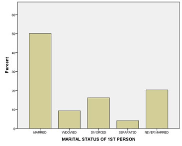
In a bar-chart the horizontal axis has the categories, to show what each bar represents. An example is shown in figure 1.
Figure 1
Results of marital status
Click here to see how to create a bar-chart
with Excel
Excel file from video VI - Bar Chart (Simple).xlsm.
with Python
Jupyter Notebook from video: VI - Bar Chart (Simple).ipynb.
Data file used: GSS2012a.csv.
with R (Studio)
R script from video VI - Bar Chart (Simple).R.
Data file used: GSS2012-Adjusted.sav.
with SPSS
There are a few different ways to obtain a (simple) bar-chart with SPSS. The end result for each will be the same.
using Chart builder
Watch the video below, or follow the instructions in this pdf (via bitly, opens in new window/tab).
Data file used: StudentStatistics.sav.
using Legacy dialogs
Watch the video below, or follow the instructions in this pdf (via bitly, opens in new window/tab).
Data file used: StudentStatistics.sav.
using Frequencies
Watch the video below, or follow the instructions in this pdf (via bitly, opens in new window/tab).
Data file used: StudentStatistics.sav.
using an existing table
Watch the video below, or follow the instructions in this pdf (via bitly, opens in new window/tab)
Data file used: StudentStatistics.sav.
There are some variations, with splitting the bars by another variable, and/or stacking the bars. See the sections below for these variations.
As a guideline for the size of the bar there is a rule of thumb known as the 'three quarter high rule' (Pitts, 1971). It means that the height of the vertical axis should be 3/4 of the length of the horizontal axis. So if the horizontal axis is 20 cm long, the vertical axis should be 3/4 * 20 = 15 cm high.
According to Singh (2009) vertical bars (instead of horizontal bars) are preferred since they are easier on the eye. However if you have long category names some names might become unreadable. A bar chart with the bars placed horizontally might then be preferred. One of the earliest found bar-charts from William Playfair (1786) has the bars placed horizontally. There is an earlier bar chart by Oresme (1486), but that is used more for a theoretical concept, than for descriptive statistics.
Multiple Bar Chart (nominal (or binary) vs. nominal (or binary))
The bars can be split into multiple bars based on another variable. This is then known as a multiple bar-chart (Kemp & Kemp, 2004, p. 150) or clustered bar-chart (Brase, 2009, p. 50; Griffith, 2007, p. 168).
It can be defined as “a bar chart for comparing the frequencies of a categorical variable in two or more situations” (Upton & Cook, 2014, p. 283). An example is shown in Figure 2
Figure 2.
Example of a Clustered Bar-Chart.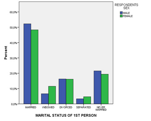
Click here to see how you can create a clustered bar-chart ...
with Excel
Excel file: VI - Bar Chart - Clustered.xlsm
with SPSS
There are a two different ways to create a clustered bar chart with SPSS.
using the chart builder
Data file: GSS2012-Adjusted.sav.
using legacy dialogs
Data file: GSS2012-Adjusted.sav.
Alternatives for a clustered bar-chart could be a spine plot, or a waffle chart.
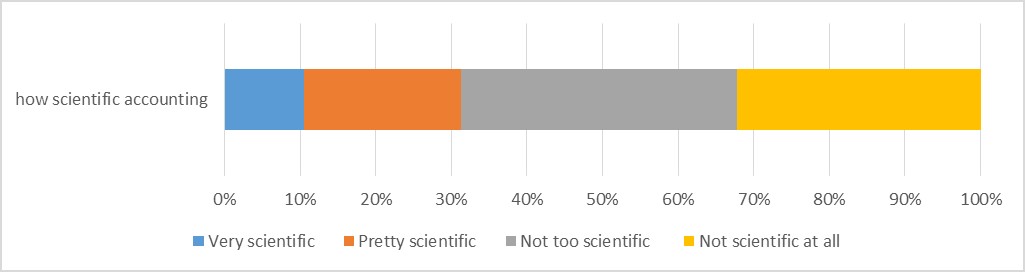
Stacked Bar Chart (single ordinal)
Instead of the bars next to each other, it can also be beneficial to stack them on top of each other. This is called a compound bar chart, or sometimes stacked bar chart (Wilkinson, 2005, p. 157) or component bar chart (Zedeck, 2014, p. 54). It can be defined as: “a bar chart showing multiple bars stacked at each x-axis category, each representing a value of the stacking variable” (Upton & Cook, 2014, p. 88). An example is shown in Figure 3.
Figure 3.
Example of a compound bar-chart of a single ordinal variable
Click here to see how to create a stacked bar-chart
with Excel
Excel file from video: VI - Bar Chart (Stacked - Single) (E).xlsm
with Python
Jupyter Notebook: VI - Bar Chart (Stacked Single) (P).ipynb
with stikpetP library:
without stikpetP library:
with R
Jupyter Notebook: VI - Bar Chart (Stacked Single) (R).ipynb
with stikpetR library:
without stikpetR library:
with SPSS
Datafile used in video: GSS2012-Adjusted.sav
From the figure we can immediately see that only about 30% find accounting pretty or very scientific, while the others do not.
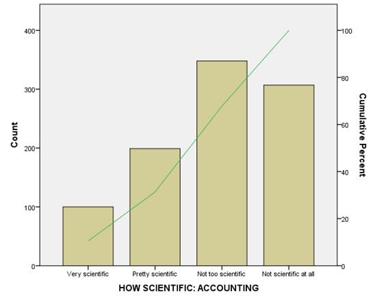
An alternative for the compound bar-chart might be a dual axis bar-chart showing both the count and the cumulative percentage. Although this would provide more information it is a bit harder to read for most people.
Dual Axis Bar Chart (single ordinal)
To also make use of the order that is available with an ordinal variable, we can add a secondary vertical axis, that shows the cumulative frequencies, or cumulative percent. This can be called a dual-axis bar-chart. An example is shown in Figure 4.
Figure 4.
Example of a dual-axis bar-chart
Click here see how to create this dual-axis bar-chart.
with Excel
Excel file from video: VI - Bar Chart (Dual Axis) (E).xlsm
with Python
Jupyter Notebook: VI - Bar Chart (Dual Axis) (P).ipynb
with stikpetP library:
without stikpetP library:
with R
Jupyter Notebook: VI - Bar Chart (Dual Axis) (R).ipynb
with stikpetR library:
without stikpetR library:
with SPSS
Datafile used in video: GSS2012-Adjusted.sav
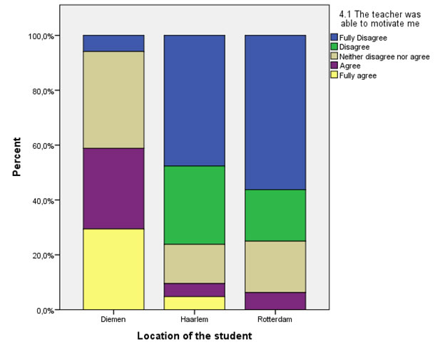
Multiple Stacked Bar-Chart (binary/nominal vs. ordinal)
we can make multiple stacked bar-charts, based on another variable, which gives a multiple compound bar-chart. An example is shown in Figure 5.
Figure 5.
Example of a multiple compound bar-chart
Click here to see how you can create a stacked/compound bar-chart...
with SPSS
using Chart builder
using Legacy dialogs
converting a cross table
with R (Studio)
with Excel
with Python

Google adds