
Pie Chart / Circle Diagram
Note: if you prefer to watch a video on pie-charts click here
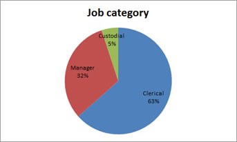
As the name implies a circle diagram is a circle divided into slices (sometimes called wedges or sections), each representing a category as in the example shown in Figure 1.
Although various definitions exist, they all describe the same shape, for example: “a graphic display in which a circle is cut into wedges with the area of thee each wedge being proportional tot he percentage of cases in the category represented by that wedge” (Zedeck, 2014, p. 260)
Figure 1
Job Category
Click here to see how to create a pie chart
with Excel
Excel file used: VI - Pie chart.xlsm
with Python
Jupyter notebook used: VI - Pie Chart.ipynb
Data file used: GSS2012a.csv
with R
Jupyter Notebook from video: VI - Pie chart.ipynb
R code from video: VI - Pie chart.R
Data file used: GSS2012-Adjusted.sav
with SPSS
There are a four different ways to create a pie-chart with SPSS. The end result for each will be the same.
using Chart builder
watch the video below, or download the pdf instructions (via bitly, opens in new window/tab).
Data file used: StudentStatistics.sav
using legacy dialogs
watch the video below, or download the pdf instructions (via bitly, opens in new window/tab).
Data file used: StudentStatistics.sav
using an existing table
watch the video below, or download the pdf instructions (via bitly, opens in new window/tab).
Data file used: StudentStatistics.sav
using Frequencies
watch the video below, or download the pdf instructions (via bitly, opens in new window/tab).
Data file used: StudentStatistics.sav
Manually
There are some alternatives for a , these include simple bar-chart, (Cleveland) dotplot, and Pareto chart. There are also many variations to the circle diagram. Some only add a visual effect (moving one or more slices out of the centre a.k.a. exploded), and some more complex variations (doughnut charts, spie charts, etc.).
The name 'pie chart' might come from a misspelling of the word Pi. Pi is often associated with a circle. It might also simply come from the resemblances with a pie (as in apple-pie). However Srivastava and Rego (2011) put forward another belief that it is named after a royal French cook Pie, who served dishes in a pie-chart shape.
The earliest found circle diagram is found on the inlay of a book by William Playfair (1801) shown in Figure 2.
Figure 2
Job Category
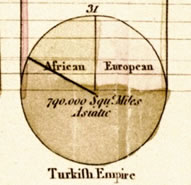
Note: Reprinted from The statistical breviary: shewing the resources of every state and kingdom (p. inlay), by W. Playfair, 1801, London: T. Bensley
The circle diagram is quite popular and often used, but actually has a few disadvantages:
- It can only show relative frequencies. To show other frequencies the numbers themselves have to be added. A circle has 360 degrees, equal to 100%. So by multiplying the relative frequencies with 360, the degrees for each category can be found. This means that visually the circle diagram can only show the relative frequencies.
- When the relative frequencies are close to each other, the differences are not easily seen in a circle diagram.
- When there are many categories the circle diagram will look very busy and not easily to read.
- The circle diagram can only show one variable.
In the expandable section below, some examples of misleading or bad pie-charts
Examples of Misleading Pie-charts
An example of a 'bad' circle diagram was created by a program called ‘The Archivist’ and used in an article online (Perez, 2009) is shown in Figure 3.
Figure 3
Example of a pie chart with too many slices
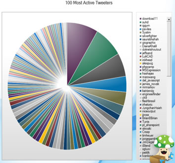
Note: Reprinted from 10 Ways to Archive Your Tweets, by S. Perez, 2009, Retrieved from http://readwrite.com/2009/08/10/10_ways_to_archive_your_tweets.
There are clearly too many categories and the few biggest slices are difficult to tell which is bigger. A possible solution in this case could have been to group the smallest categories into one category 'Other' and then still use a bar-chart instead.
Another example of a 'bad' circle diagram comes from The Economist (Kyd, 2012) shown in Figure 4.
Figure 4
Example of pie chart with rel. freq. too close to each other
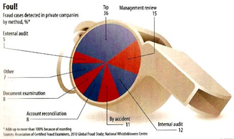
Note: Reprinted from Good Examples of Bad Charts: Chart Junk from a Surprising Source, by C. Kyd, 2012, Retrieved from http://exceluser.com/blog/1133/good-examples-of-bad-charts-chart-junk-from-a-surprising-source.html
It is very difficult to see the differences. It is not until you look at the numbers that you can tell which slices are bigger or smaller (with a few exceptions). A bar-chart would have been preferred.
A third example comes from fox-news, shown in Figure 5.
Figure 5
Example of a pie chart with percentages not adding up to 100.
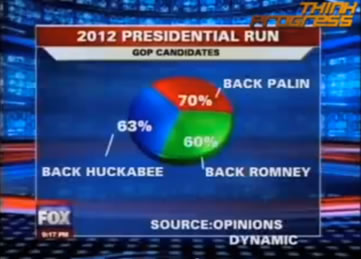
This seems pretty odd that the percentages do not add up to 100%. This is probably because people could choose multiple options. The size of the slices is then somewhat irrelevant. A bar-chart would have been preferred here.
In newspapers and magazines a 3D effect is added as well as for example in Figure 6.
Figure 6
Example of distortion by 3D effect in a Pie chart.
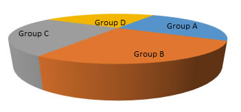
Note that Group B appears to be very big, then Group C, then Group A and Group D seems to be the smallest. However each group was actually equal in size, but because of the 3D effect the slice on the foreground appears larger than those in the background. It is therefore recommended to avoid using these kind of 3D effects.

Google adds