
Spine Plot
Explanation
A spine plot is similar to a multiple stacked bar-chart, but "the difference is that the bars fill the plot vertically so the shading gives us proportions instead of counts. Also, the width of each bar varies, reflecting the marginal proportion of observations in each workshop" (Muenchen, 2006, p. 286)
It is a chart you could use when with two nominal variables and do not have a clear independent and dependent variable. Otherwise a multiple/clustered bar-chart might be preferred.
An example of a spine plot is shown in figure 1.
Figure 1
Spine plot example
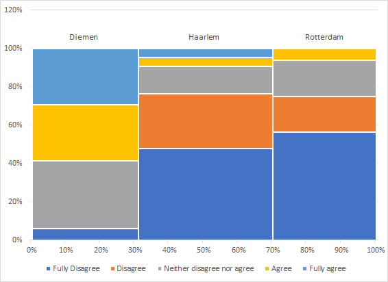
The naming of this diagram is unfortunately not very clear. I use the term 'spine plot' as a special case of a Mosaic Plot. Mosaic Plots are often attributed to Hartigan and Kleiner (for example by Friendly (2002, p. 90)). Earlier versions are actually known, for example Walker (1874, p. PI XX). Hartigan and Kleiner (1981) start their paper with a Mosaic Plot for a cross table, but end it with showing Mosaic Plots for multiple dimension cross tables.
A Marimekko Chart is simply an alternative name for the Mosaic Plot, although according to Wikipedia "mosaic plots can be colored and shaded according to deviations from independence, whereas Marimekko charts are colored according to the category levels" (Wikipedia, 2022).
The term 'Spine Plot' itself is often attributed to Hummel (1996)
Creating the diagram
with Python
Jupyter Notebook: VI - Spine Plot (P).ipynb
with stikpetP
To Be Made
without stikpetP
To Be Made
with R (Studio)
Jupyter Notebook: VI - Spine Plot (R).ipynb
with stikpetR
To Be Made
without stikpetR
Alternative
As mentioned earlier, a possible alternative could be a clustered bar-chart.
Google adds